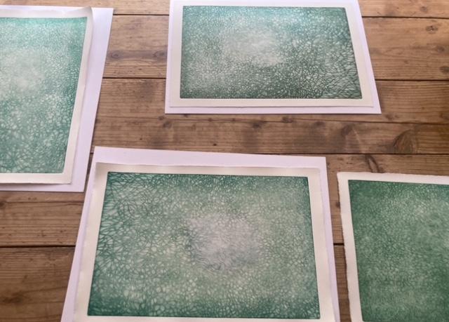
This morning, I reworked a mezzotint plate that measured 36x24cm and printed it on 4 sheets of Hahnemühle paper. However, I was not satisfied with the results.
I polished certain areas with a metal varnisher to create a light-dark contrast in the print, but those areas did not turn out as white as I had hoped. The bright green ink, which was a mixture of yellow, turquoise blue, and titanium white, seemed too weak to me.
To improve the print, I used the “à la poupee “ technique to add light turquoise blue to the central part of the image and printed the blank part with a slight blue tint. Hahnemühle paper has a slightly yellowish tinge, so adding bluish white to it creates the illusion of pure white. While my attempt was correct, I still felt like something was missing.
I realized that prints should be composed of distinct shapes and colors to attract the viewer’s attention. Paintings can be subtle, complex, and ambiguous to appeal to the viewer, but prints do not need to be complicated in the first place. People want to see the skill, ingenuity, and warmth of the artist’s hands reflected in a clear and simple print. I need to think more deeply about why I make prints and what purpose they serve.
It’s similar to my experience writing in English. As a Japanese writer, I can use complex sentences in Japanese, but when I write in English, I strive to keep my thoughts simple and easy to understand. My English skills are not advanced enough to make ambiguous expressions, and the more I write, the more mistakes I make. Therefore, I focus on crafting straightforward sentences.
Printmaking is an art form that was originally created for reproduction, to share the artwork with as many people as possible. As such, it is important to create prints that can be enjoyed by a wide audience, without making things too complicated or spending too much time on them. In other words, a print is something that can be designed and created with ease.